Section4

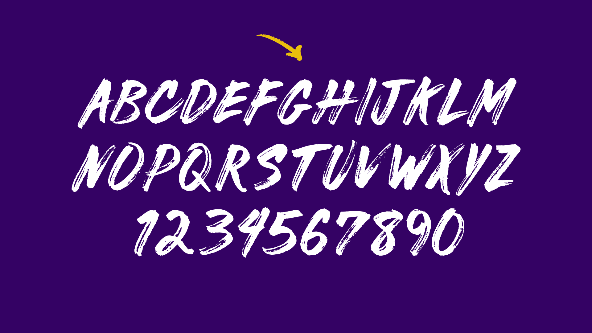
A fresh and rebellious take on the traditionally dull business news format. Section4 dissects the latest stories into short data-centric segments injected with wit and humor to create programming that’s both insightful and entertaining. As a member of the founding team I was tasked with developing a brand that was youthful, rebellious, and intellectual, with the goal of giving viewers the knowledge and tools to compete and grow in their fields. Brand assets included a distinct brand identity, website and mobile app, custom hand-drawn font, logo designs for its video shows, and the framework for the video shows themselves, working with developers and motion graphic designers to execute the vision.

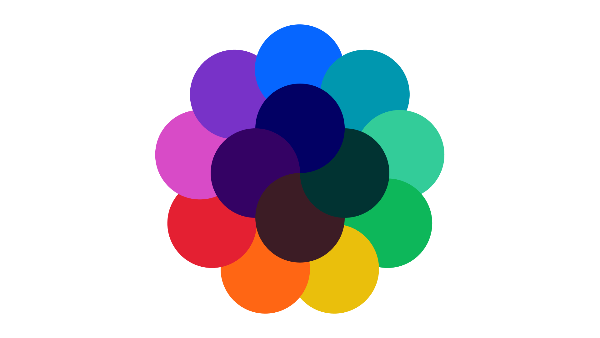
The branding uses a hand-drawn logo and typography to bring life, energy, and urgency to the brand aesthetic. Its color palette uses four dark base colors that add seriousness and serve as a foundation for the brighter more vibrant colors in the palette. These merge together in the brand’s background graphics, morphing colors into a vibrant array of color combinations for brand materials.
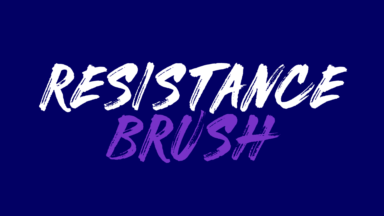
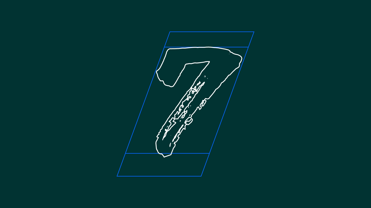
Custom hand-drawn font ‘Resistance Brush’

The mobile app and website platforms for Section4 use a simple interface design that prioritizes its latest videos and most covered topics, using the brand's distinct background graphics to add visual interest. Each platform allows users to save videos to their own curated library and follow topics that interest them the most. In-video tooltips give users access to additional resources and links to related videos, connecting various topics and show types for further content discovery.
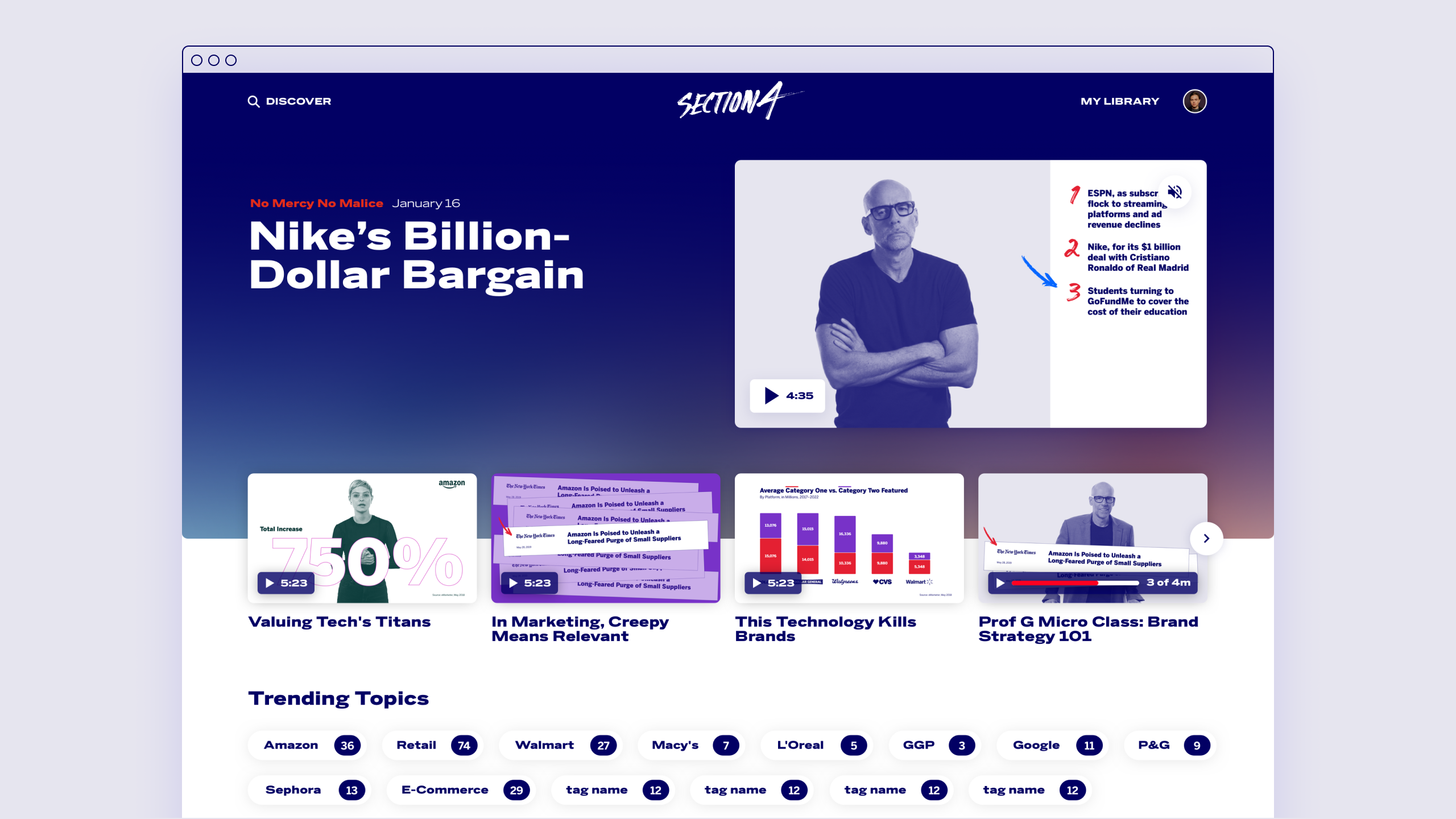
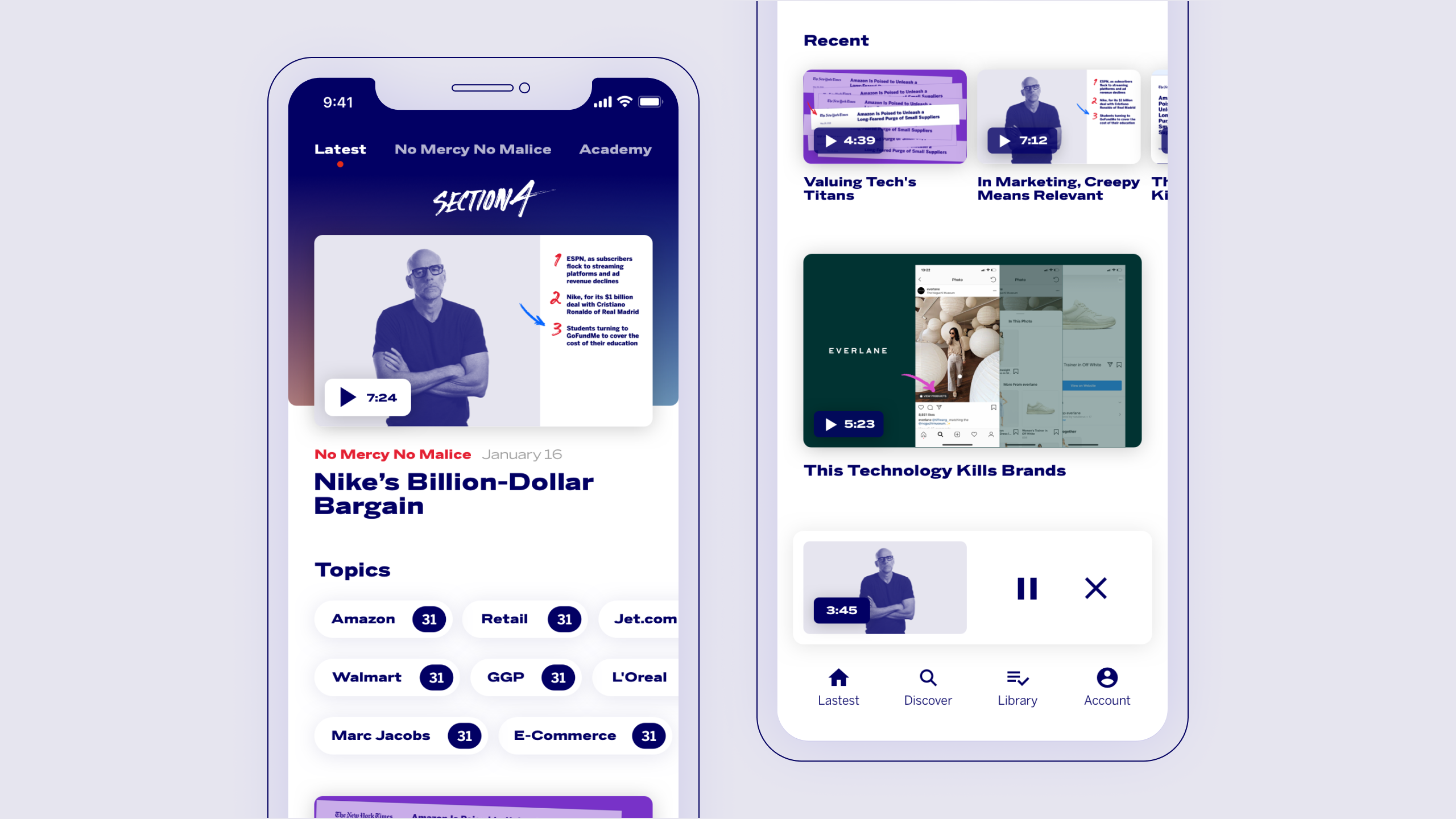
Mobile app homepage and minimized video for exploring content.

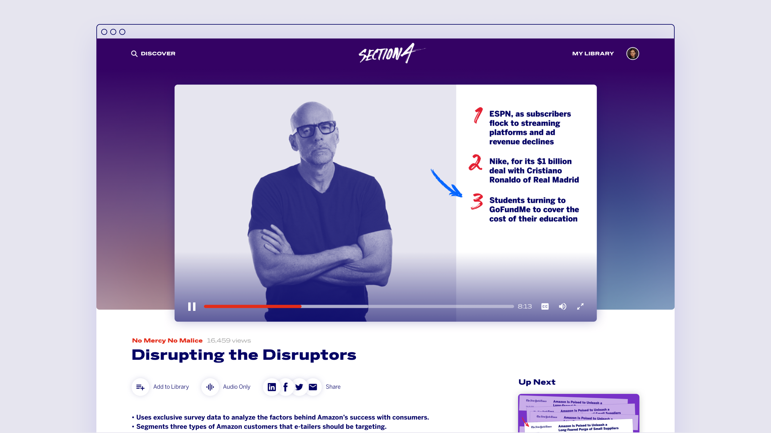
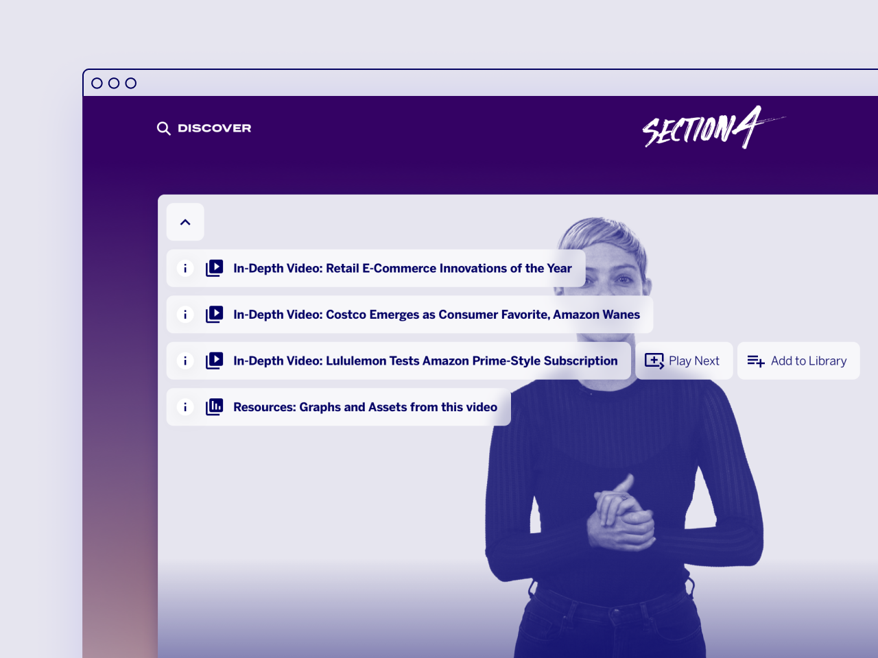
In-video tooltips allow users to discover videos and access resources.
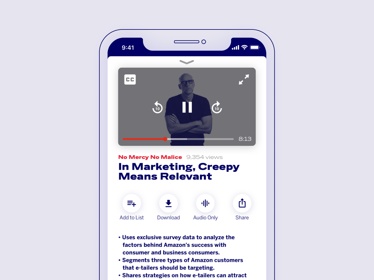
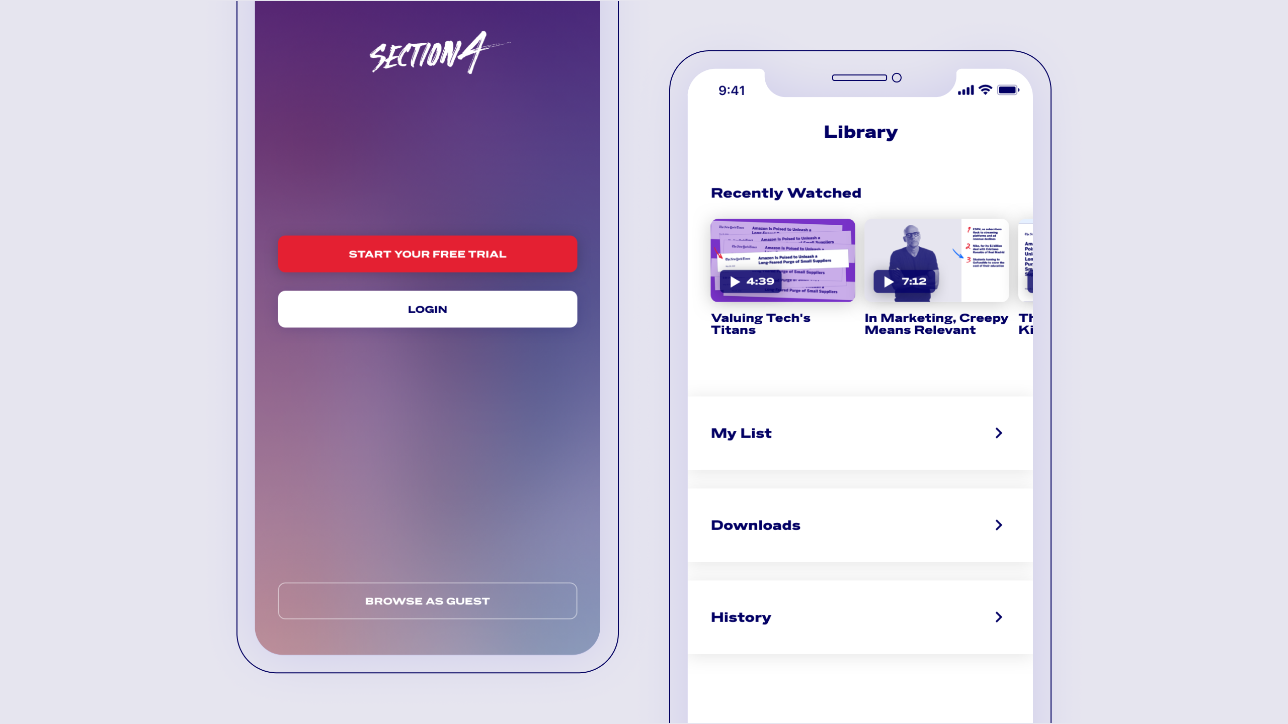
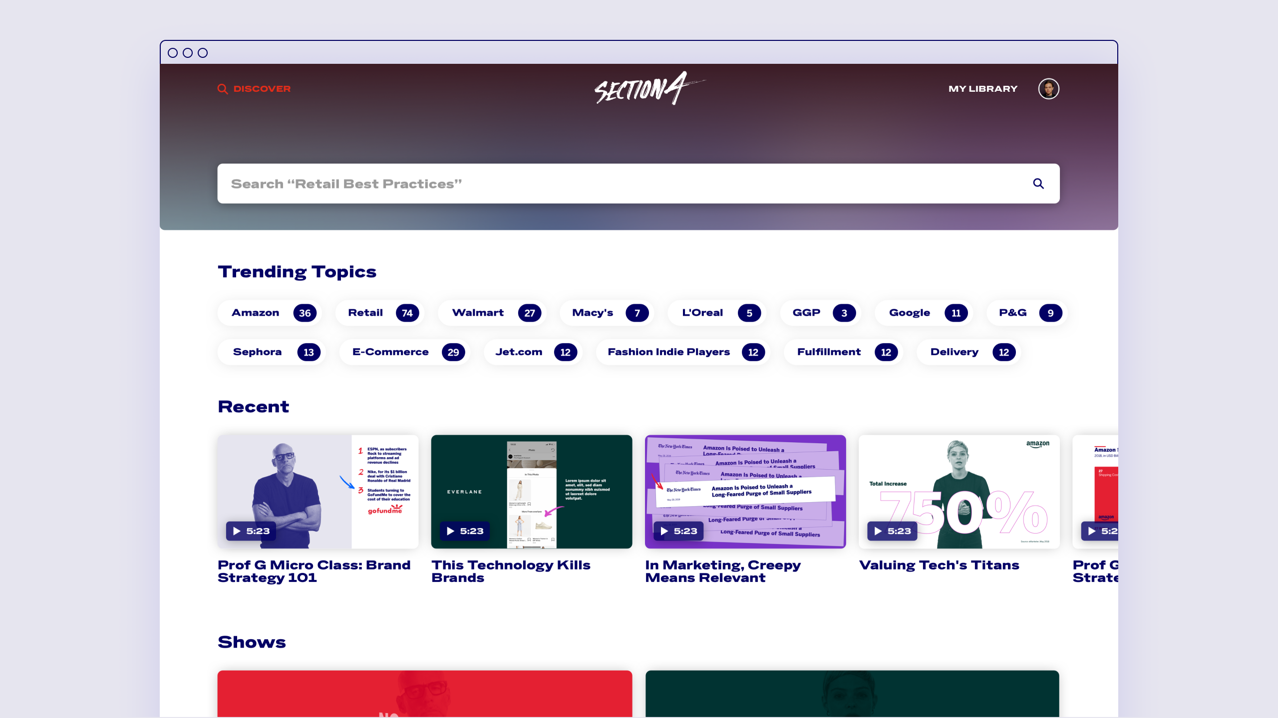
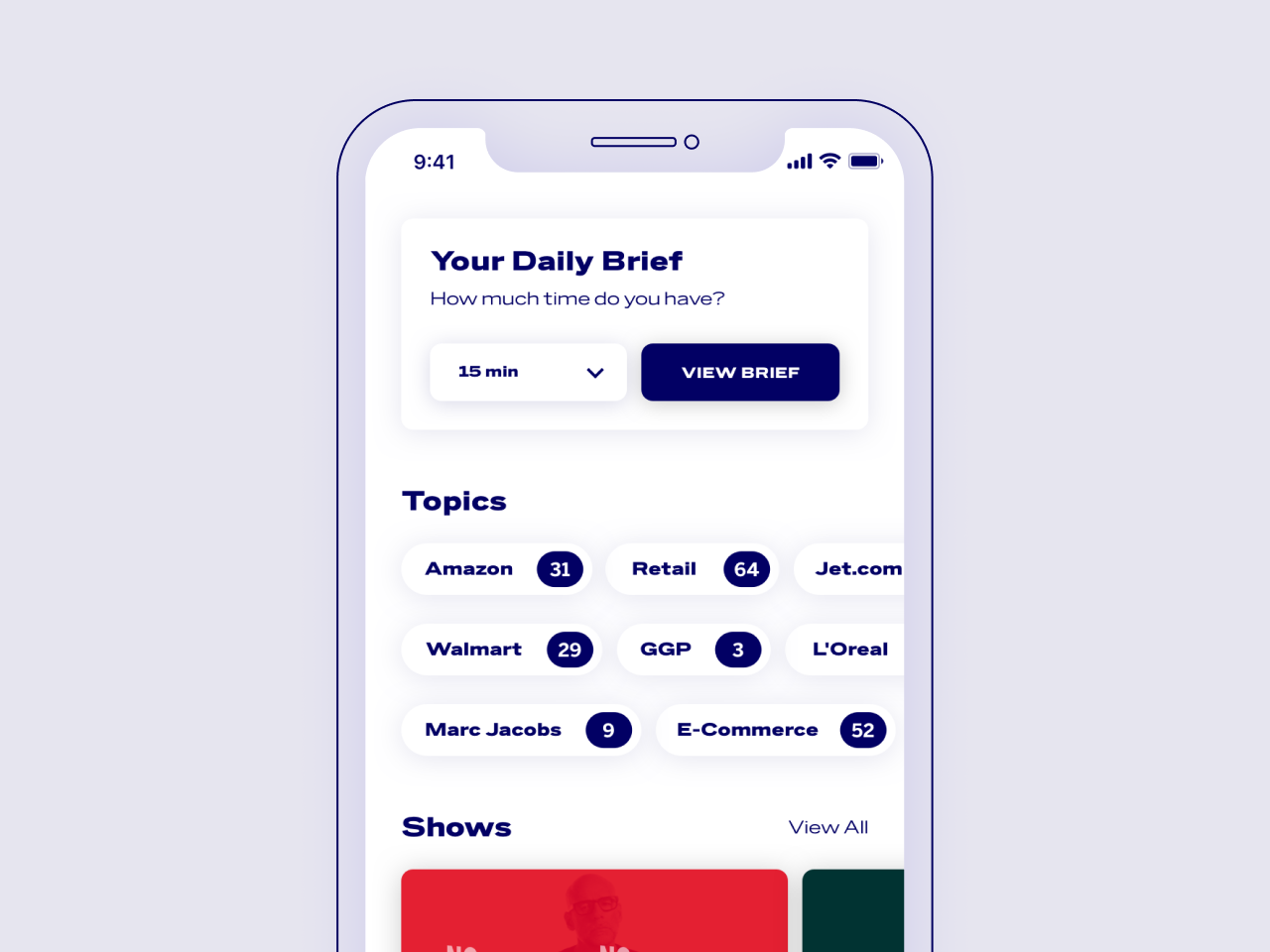
The mobile app allows users to create a time specific daily brief.
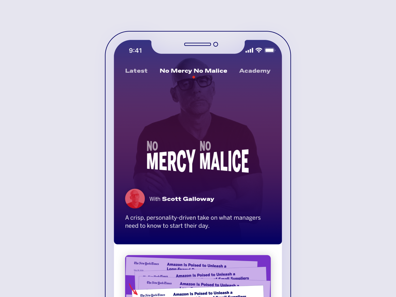
The videos use a universal template design for all content types and interstitials, utilizing a flexible grid system. Each show has a unique color palette so shows can have a distinct look while remaining cohesive to the brand. Section4’s shows are No Mercy No Malice and Academy, each with their own content focus and branding. No Mercy No Malice takes its inspiration from the megaphone, as the show itself is boisterous and personality-driven, centered around its host Scott Galloway.
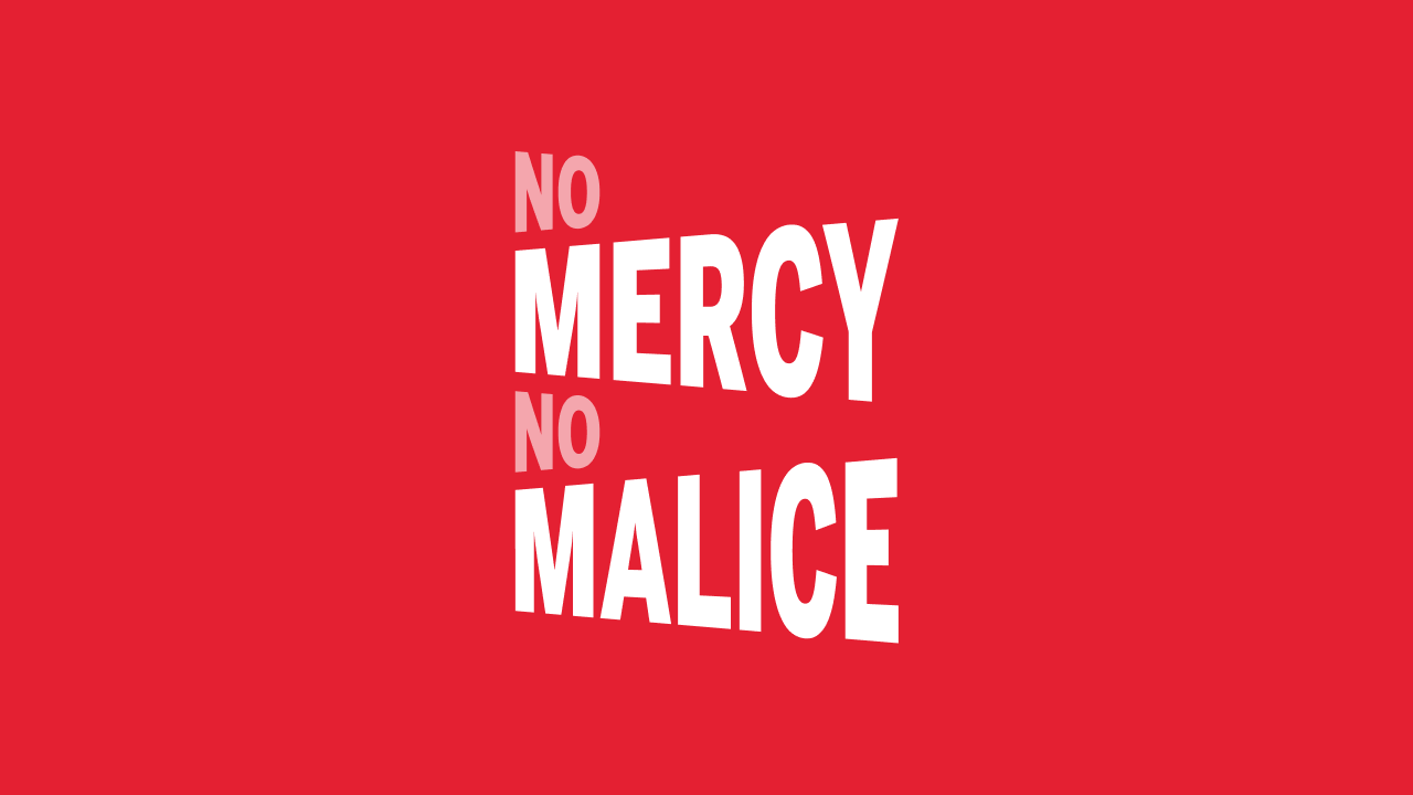
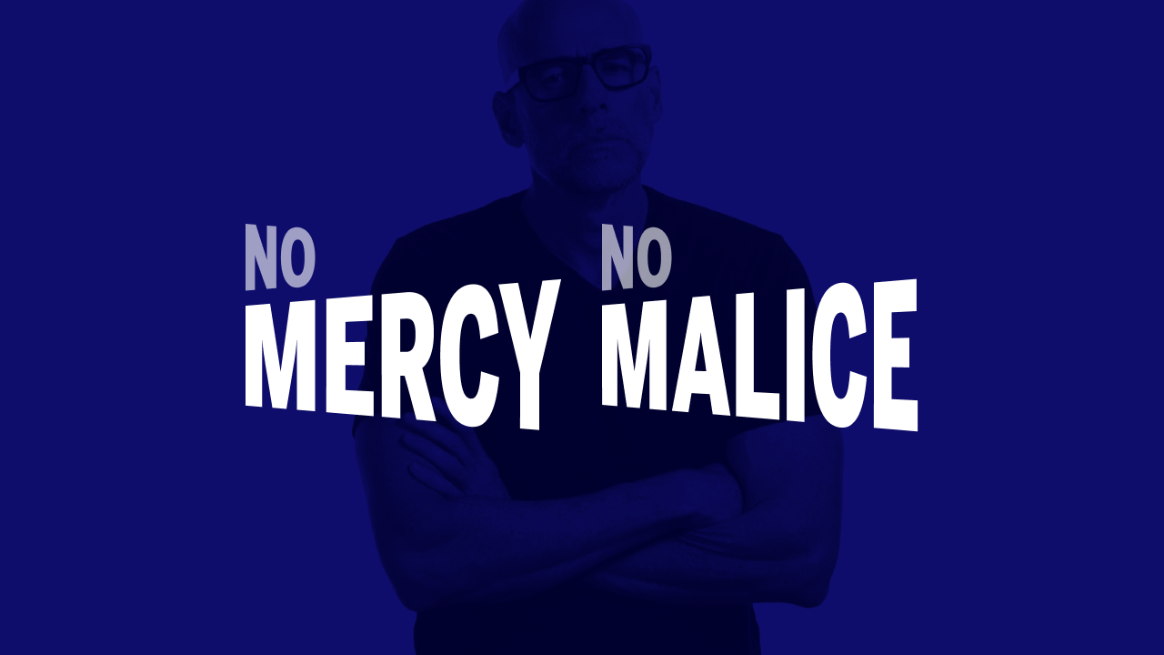
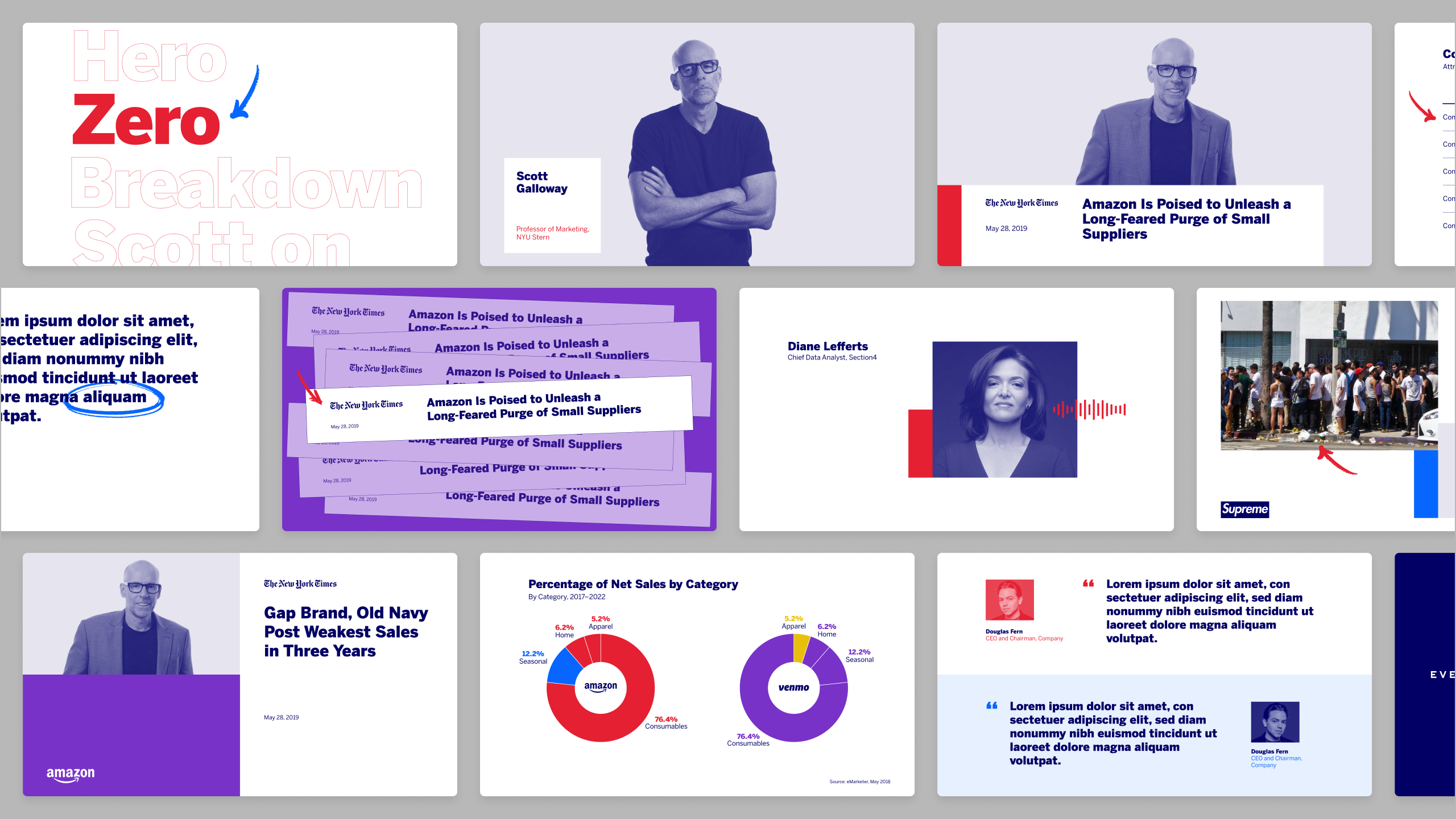
Video template designs for No Mercy No Malice.
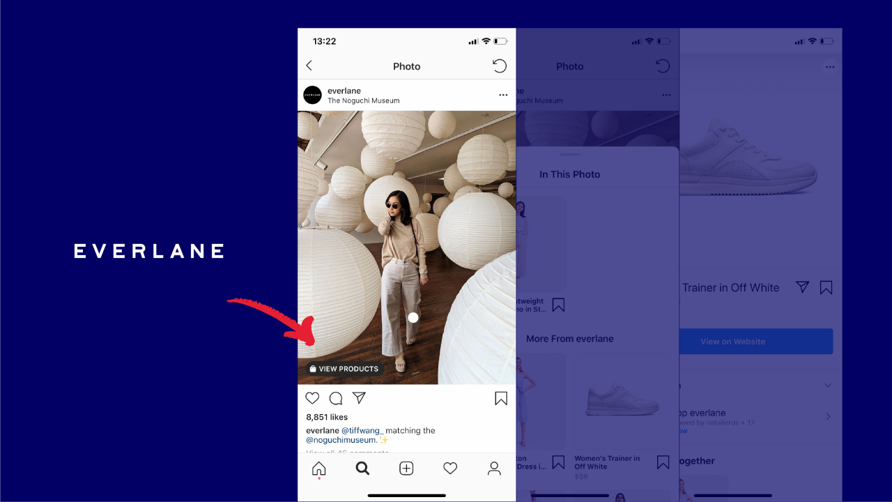
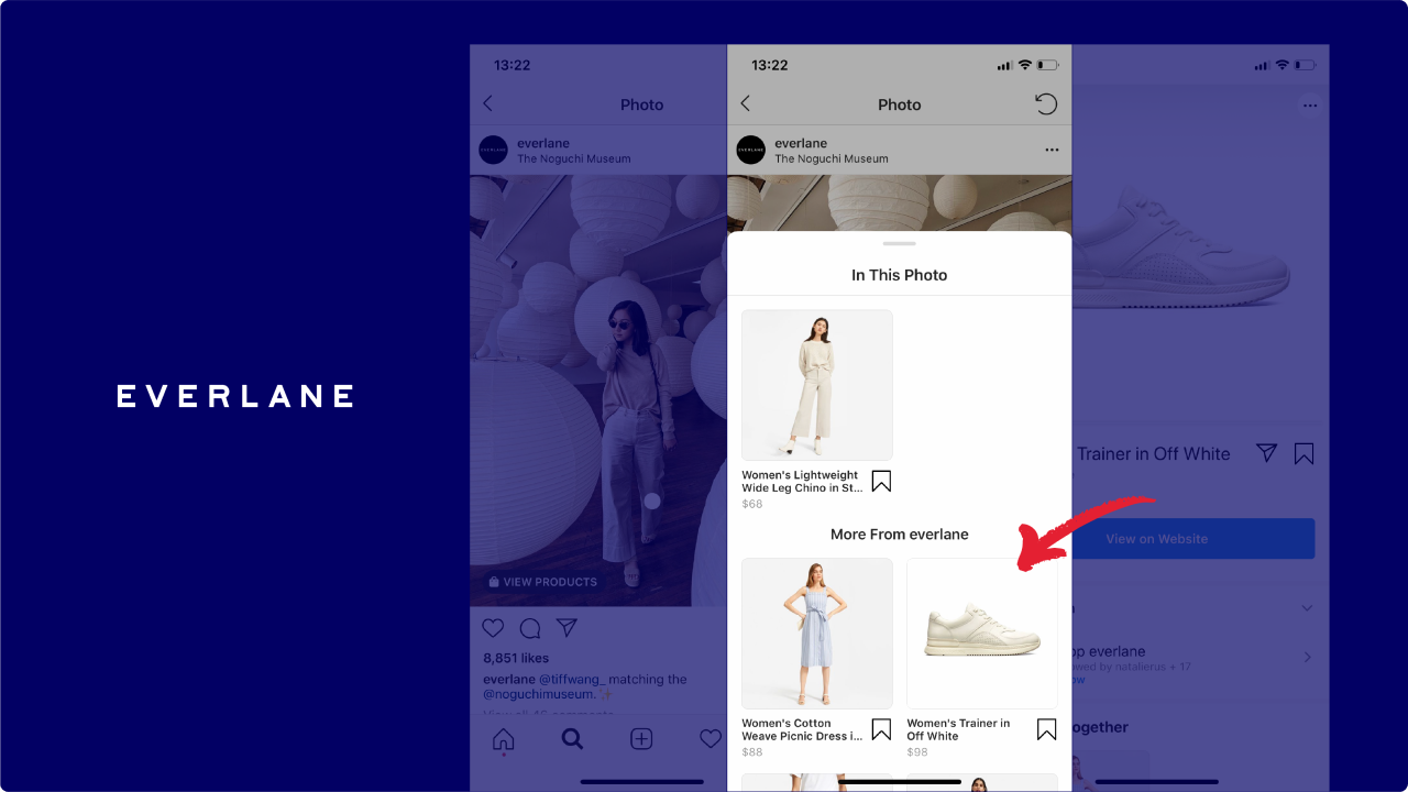
Displaying multiple screenshots is intuitive and easy to animate.

Video template grid follows title safe and action safe areas.
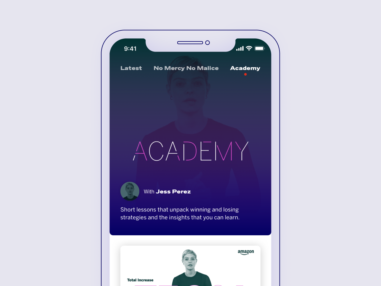
The Academy gives bite-sized lessons about business concepts and strategies to viewers. The logo is inspired by learning — putting the pieces together and discovering something new. Several color palettes were developed for the Academy for various shows under the Academy umbrella.
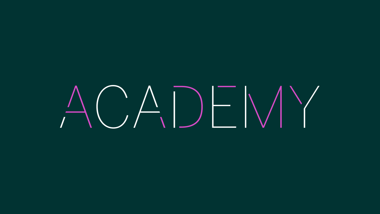
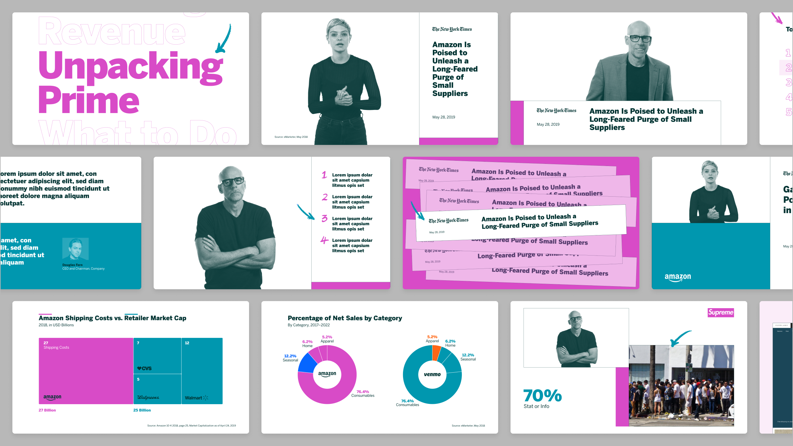
Video template designs.

Various color combinations created for show expansion.
